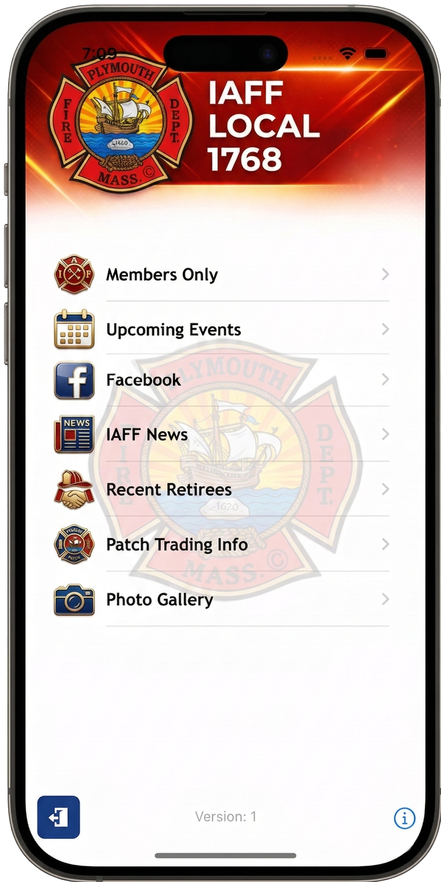
Responsive Website Design
One union website for every screen
Responsive UnionActive templates adapt navigation, images, columns, and content for phones, tablets, laptops, and desktop displays.
A consistent experience on changing devices
Responsive design uses one website and one source of content. The layout responds to the width and orientation of the screen, so administrators do not have to maintain a separate mobile site.
Flexible layout
Columns stack, images resize, and navigation reorganizes to keep content readable on smaller screens.
Unified publishing
Update a page once and make the same current information available across supported devices.
Custom identity
Tailor colors, logos, header imagery, modules, and selected layout elements to fit the organization.
Explore sample layouts
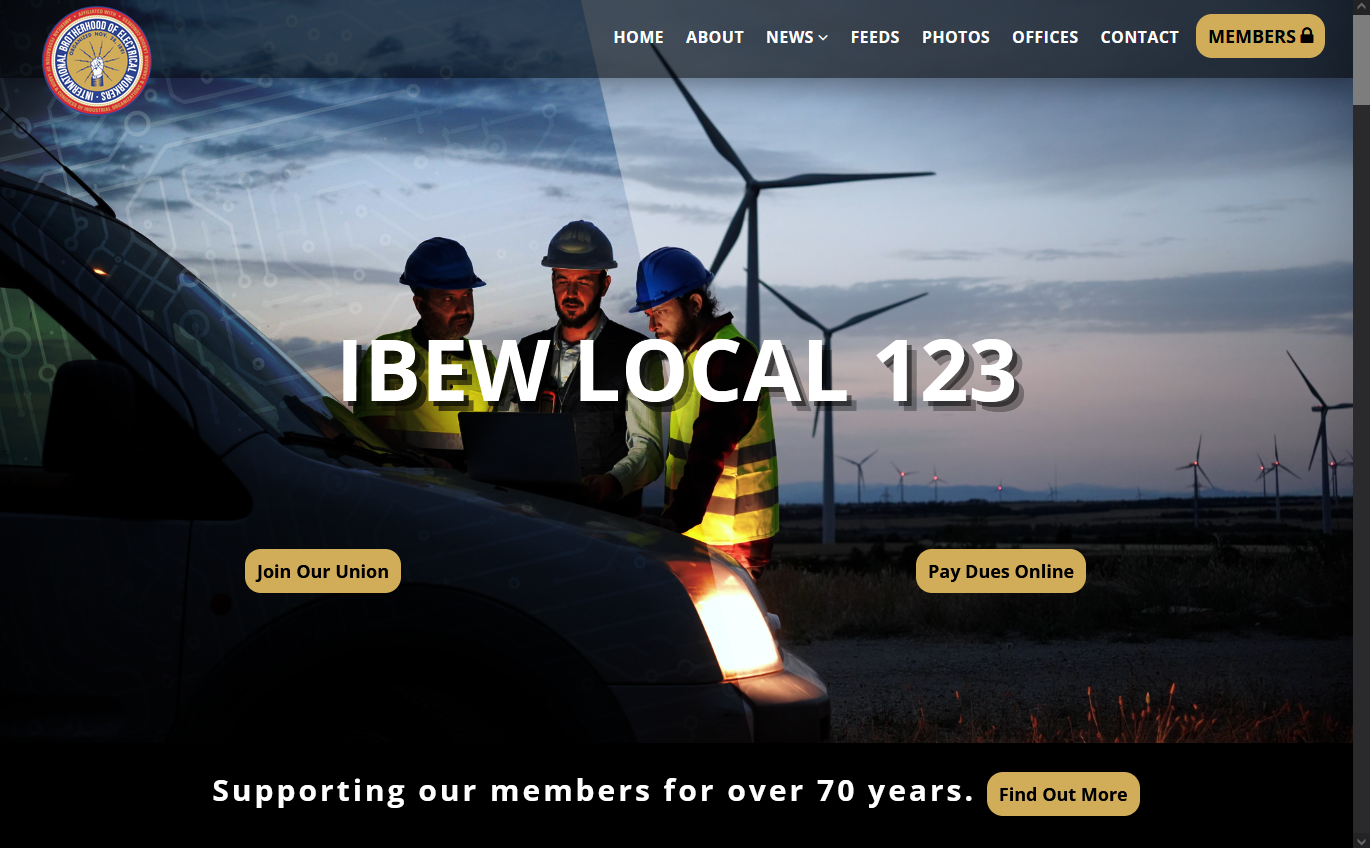

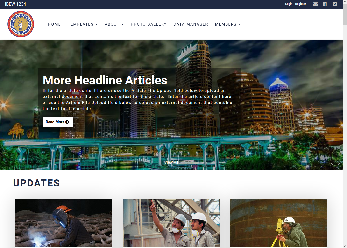
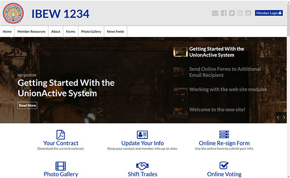
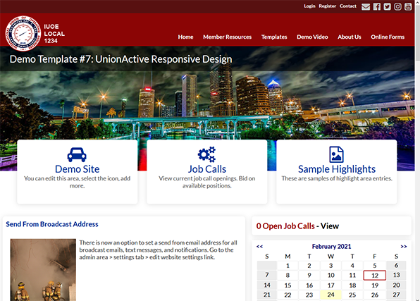

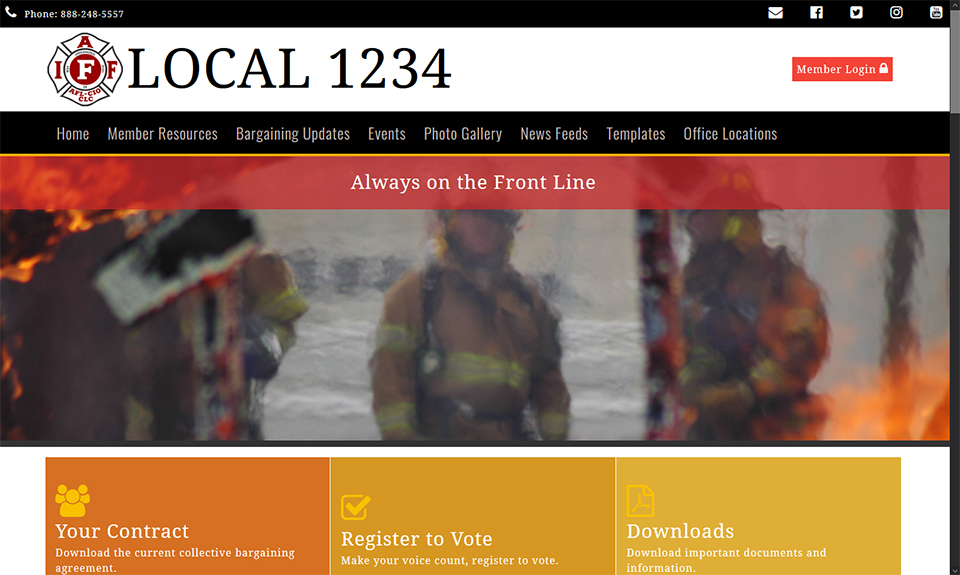
Template capabilities
- Responsive display for desktop, tablet, and mobile
- Editable image headers and visual branding
- Home-page modules for news, social content, and member tools
- Quick access to login, settings, search, sharing, and site map
- Flexible module and navigation placement
- Optional customization or elements combined from multiple designs
Refresh your UnionActive website
Request a responsive template and tell us which sample elements you prefer.